
Understanding Australia And Higher Inflation
A near record expansion in government

Quick update: Coming up next time for all subscribers, we have a piece on the evolution of housing affordability since then Treasurer Joe Hockey’s infamous commentary that young people just “need to get a good job” in order to buy a home given that it has now been 10 years since then.
If you would like to help keep the articles coming, get access to those behind the paywall or just support my efforts, that would be immensely appreciated.
With the release of the latest quarterly inflation data from the ABS revealing that inflation was strongly resurgent and significantly higher than where the RBA estimated it would be, the outlook for interest rates and perceptions of the Australian economy swiftly changed.
Some observers chalked this up to relative economic strength, but the reality is arguably quite a bit different and significantly more challenging than this relatively common perspective would imply.
The issue was recently summed up well by HSBC Chief Economist Paul Bloxham talking to the Australian Financial Review:
“The economy is already growing at, or even a bit beyond, its speed limit,”
“The problem we’ve got is weak productivity, and so just a little lift in growth and once again, we’ve got an inflation challenge.”
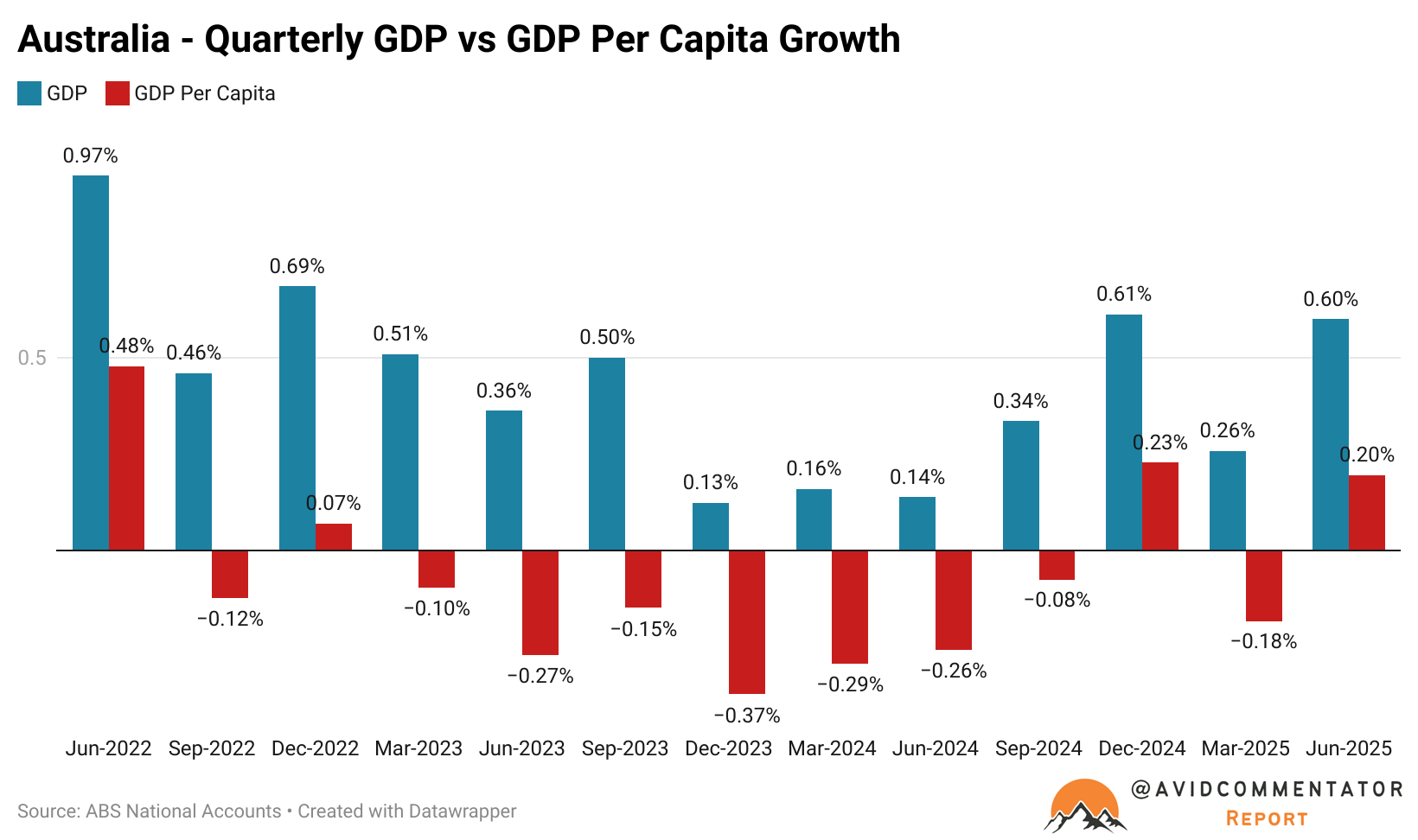
Which begs the question, how can things be so badly imbalanced within the economy that growth below 2% in headline terms and per capita growth going nowhere is creating inflationary pressures?
Expansive Government Spending
When the Albanese government came to power in May 2022, day to day government spending across all levels of government accounted for 21.2% of GDP.
This figure was well down on the absolute height of the pandemic in the June quarter of 2020, when it accounted for 23.95% of GDP and was roughly equivalent to the final pre-pandemic reading 21.23% of GDP.
Since then it has risen to 23.53% of GDP, it’s highest level on record outside of the absolute height of the pandemic in the June quarter of 2020.
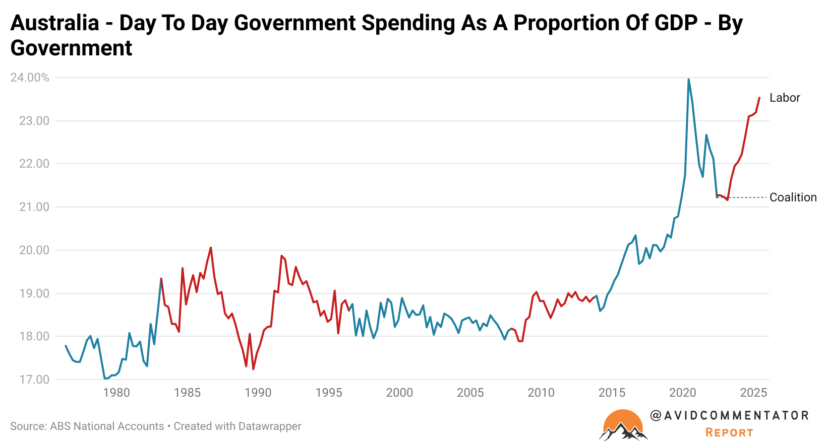
While the broader economy has continued to underperform significantly compared with trend, the rapid rise in the size of government and its arguably heavily price insensitive approach has continued to keep upward pressure on aggregate demand.
To put this into perspective, this is a chart of the evolution of the size of day to day government spending as a proportion of GDP during different eras:
The impact of the 1983 recession
The impact of the 1990 recession
The impact of the Global Financial Crisis (2008-2011)
Business as usual since the election of the Albanese government
As you can see, the expansion of government as a proportion of GDP has been more than twice as large under business as usual for the Albanese government, as it was for the Rudd and later Gillard government during a major economic crisis.
As of the current snapshot, the expansion is larger than after the same duration following the 1983 recession and just a hair’s breadth lower than where it was at a similar time in the cycle following the 1990’s recession.
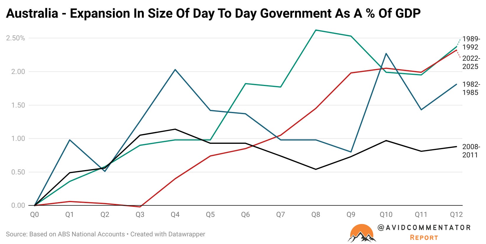
Considering that this point in the 1990s recession saw the nation’s unemployment rate at 11.0%, it’s entirely understandable why the size of day to day spending under Keating government grew so significantly, the additional expenditure on unemployment benefits alone would have been significant.
Keep reading with a 7-day free trial
Subscribe to Burnout Economics to keep reading this post and get 7 days of free access to the full post archives.